
The Problem
Leonteq's structured crypto products (Barrier Reverse Convertibles, Multi-Barrier Certificates, Tracker Certificates, Capital Protected Notes) are sophisticated instruments. Each one has a set of structural terms: strike price, barrier level, coupon observation dates, participation rate. And each product lives or dies by how the underlying asset performs relative to those levels.
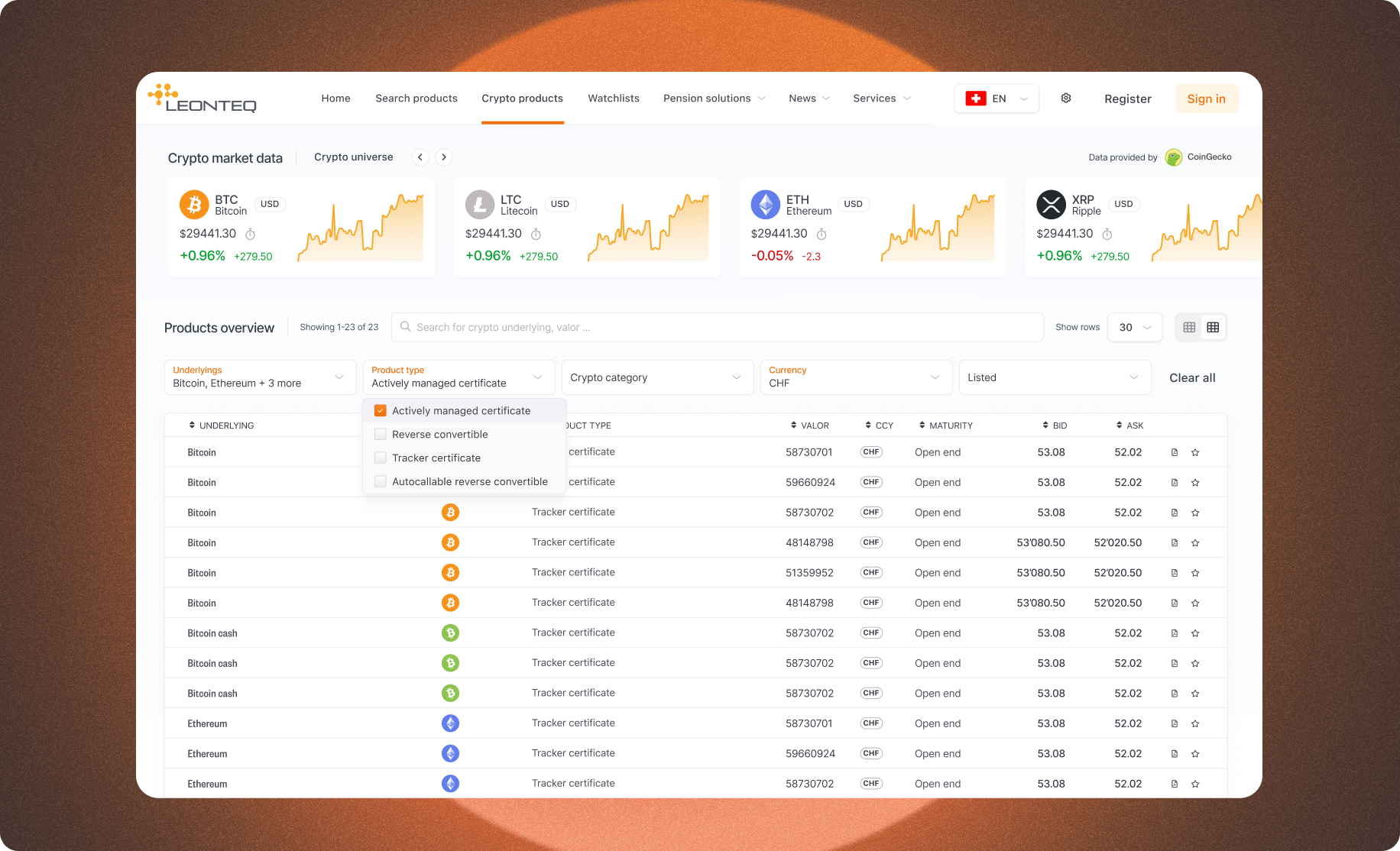
The existing interface displayed all of this as dense tables of numbers. ISIN, expiry, barrier, last price. For experienced traders, this was tolerable. For relationship managers presenting to clients, it was a liability. Nobody could quickly understand what they were looking at, let alone explain it.
>_key insight“Complexity isn't the problem. Unexpected complexity is. Give people a map of what they're about to encounter and they feel in control, even when the subject matter is genuinely hard.”
// design_process
- 01
Research
Shadowing sessions with traders, relationship managers, and institutional clients, mapping the full journey from product discovery to order placement
- 02
Architecture
Defined a three-level disclosure model: overview card → performance chart + key terms → full term sheet. Each level serves a different user need without overwhelming the first
- 03
Visual Design
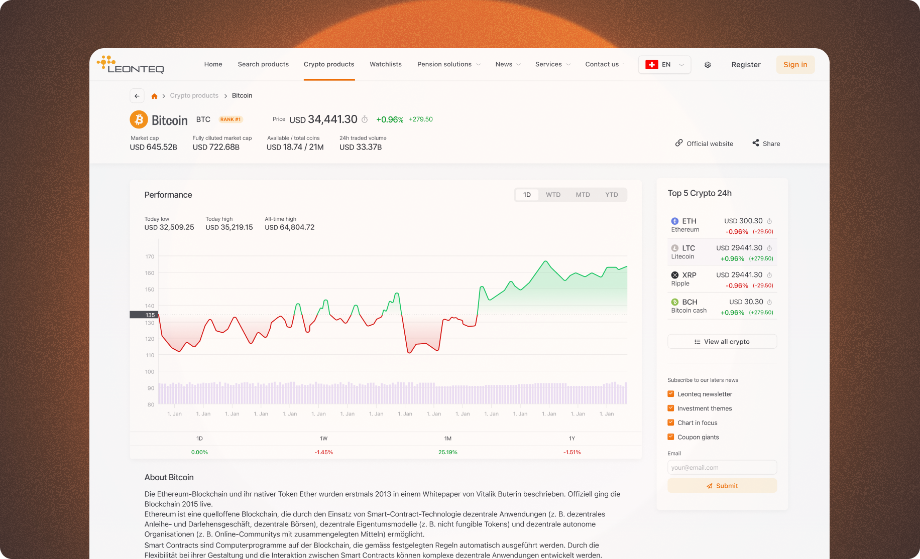
Designed the performance chart system: custom SVG charts that adapt to product type, showing underlying price history overlaid with the product's structural levels: strike, barrier, and observation dates
- 04
Prototype
Interactive prototype tested with 6 relationship managers and 4 institutional clients, iterating on how much data to surface at each level
- 05
Ship
Phased release: search and overview cards first, detail pages second, watchlist and comparison in the final phase
Performance Charts
The highest-impact decision of the project was making product performance the centrepiece of every detail page. A performance chart shows the underlying asset's price trajectory over the product's lifetime, overlaid with the structural levels that matter: strike, barrier, coupon observation dates, and current distance to barrier.
For a Barrier Reverse Convertible, a relationship manager can see at a glance whether the product is comfortably above its barrier or approaching it, and communicate that risk to a client in a single view, without translating a term sheet.
The chart system is parametric: it reads the product terms directly from the data layer and renders the correct structural overlays for each product type. The same component handles the full product range, each with the right levels, annotations, and risk indicators for its specific structure.
0%
faster product discovery, avg. search-to-selection time
0%
reduction in support queries about product structure
0x
increase in average product detail page engagement
0%
of pilot users preferred the new interface in A/B test
What This Project Taught Me
Working in crypto taught me to design for volatility. Literally. The UI needed to communicate calm and confidence even when the underlying numbers were moving fast. Every visual decision, from white space to type weight to colour, was in service of that feeling.
It also reinforced something I believe deeply: visualisation is not decoration. The performance chart is information design doing real work, reducing cognitive load, enabling better client conversations, and ultimately making the product more valuable.