The Problem
Every Leonteq product had quietly diverged. The same button existed in twelve implementations across eight codebases. Design decisions made three years ago in one product had been copy-pasted into six others, bugs and all.
A designer joining a new product team spent their first week cataloguing UI patterns instead of solving user problems. And for employees switching between Leonteq tools, every product felt slightly different, like being in the same house with all the furniture rearranged. Close enough to expect familiarity. Different enough to cause friction.
>_key insight“A design system isn't a component library. It's a shared language. And like any language, it only works if people actually speak it.”
// design_process
- 01
Audit
Full UI inventory across 8 products: every component variant, colour value, spacing deviation, and naming convention. 1,200+ screenshots catalogued
- 02
Tokens
Built the semantic token layer from scratch: colour (light/dark), spacing scale, typography, border radii, shadows. Full Figma-to-code parity.
- 03
Components
Vue.js component library with TypeScript props, a custom documentation site with live API reference, component property controls, and direct Figma links — all built in-house
- 04
Adoption
Embedded with each product team for migration sprints. "Moneypenny Fridays": monthly cross-team sessions to review proposals and contributions
- 05
Governance
RFC process for new components, semver releases, and a formal deprecation policy. Every component ships with a changelog, migration guide, and living design spec in Figma
<template>
  <button
    :class="[
      'mp-btn',
      `mp-btn--${variant}`,
      `mp-btn--${size}`,
      { 'mp-btn--loading': loading }
    ]"
    :disabled="disabled || loading"
    v-bind="$attrs"
  >
    <MpSpinner v-if="loading" size="xs" aria-hidden />
    <slot v-else />
  </button>
</template>

<script setup lang="ts">
defineProps<{
  variant?: 'primary' | 'secondary' | 'ghost' | 'danger'
  size?:    'sm' | 'md' | 'lg'
  disabled?: boolean
  loading?:  boolean
}>()
</script>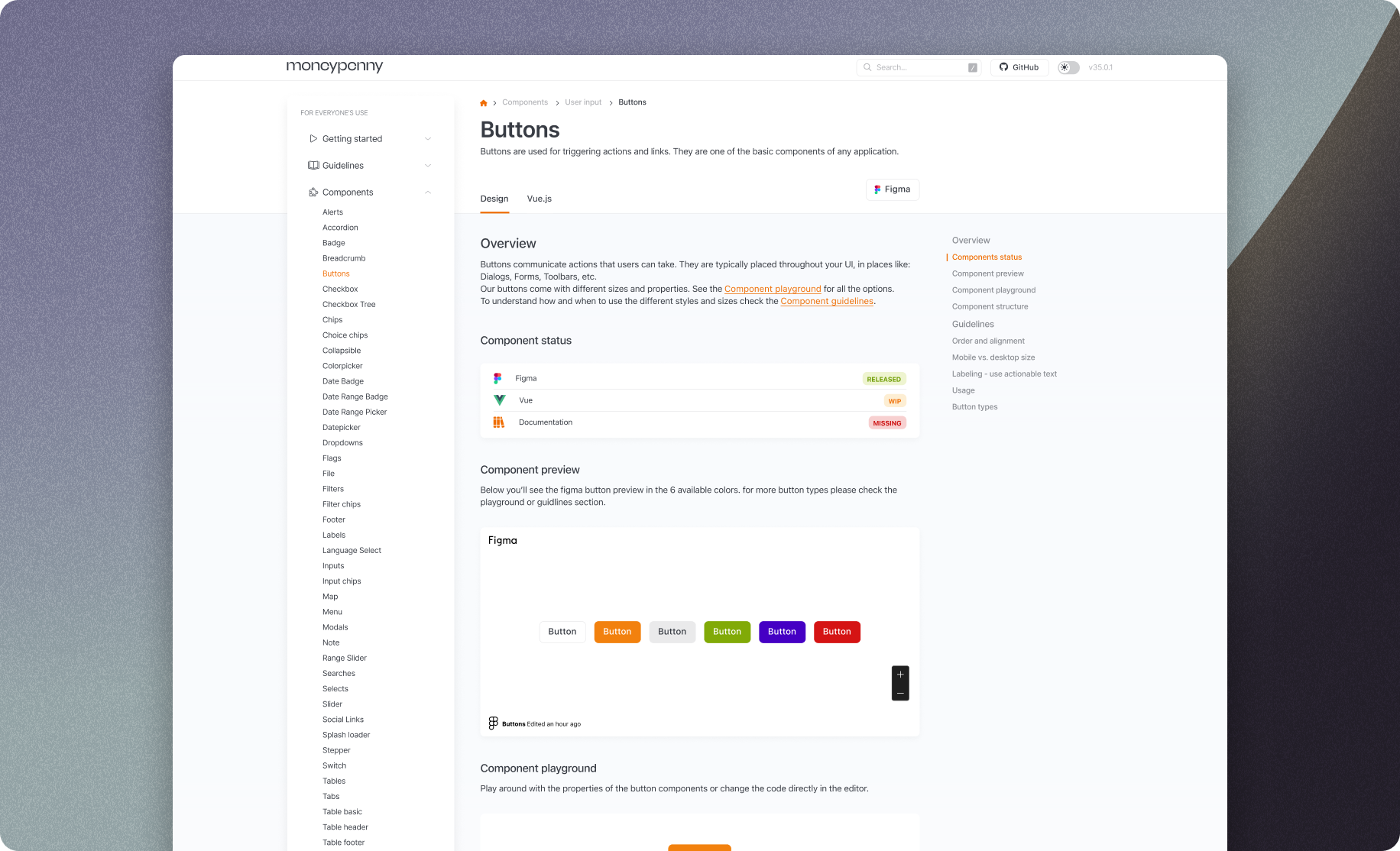
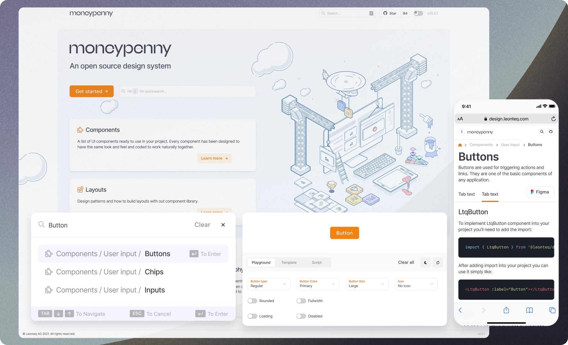
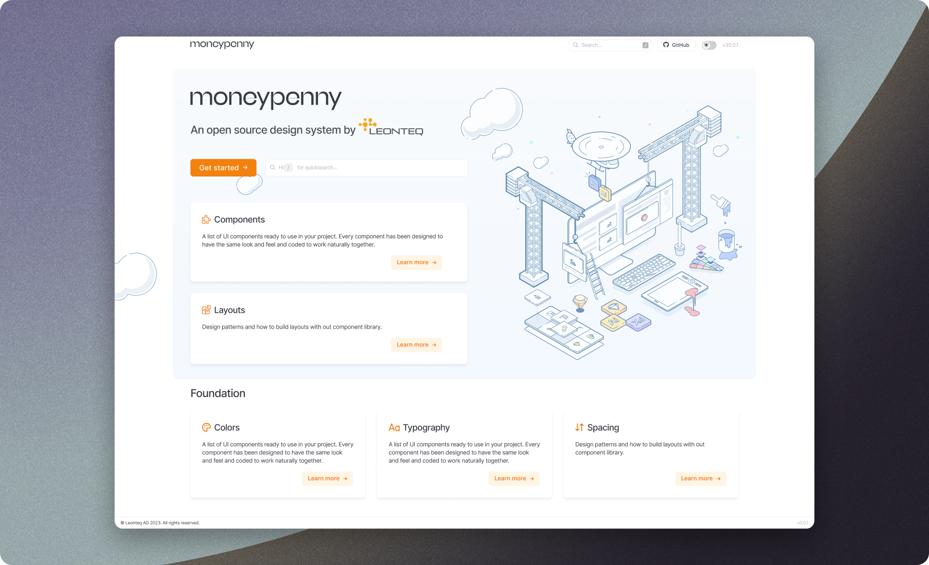
60+ production components. Every variant, state, and interaction documented.
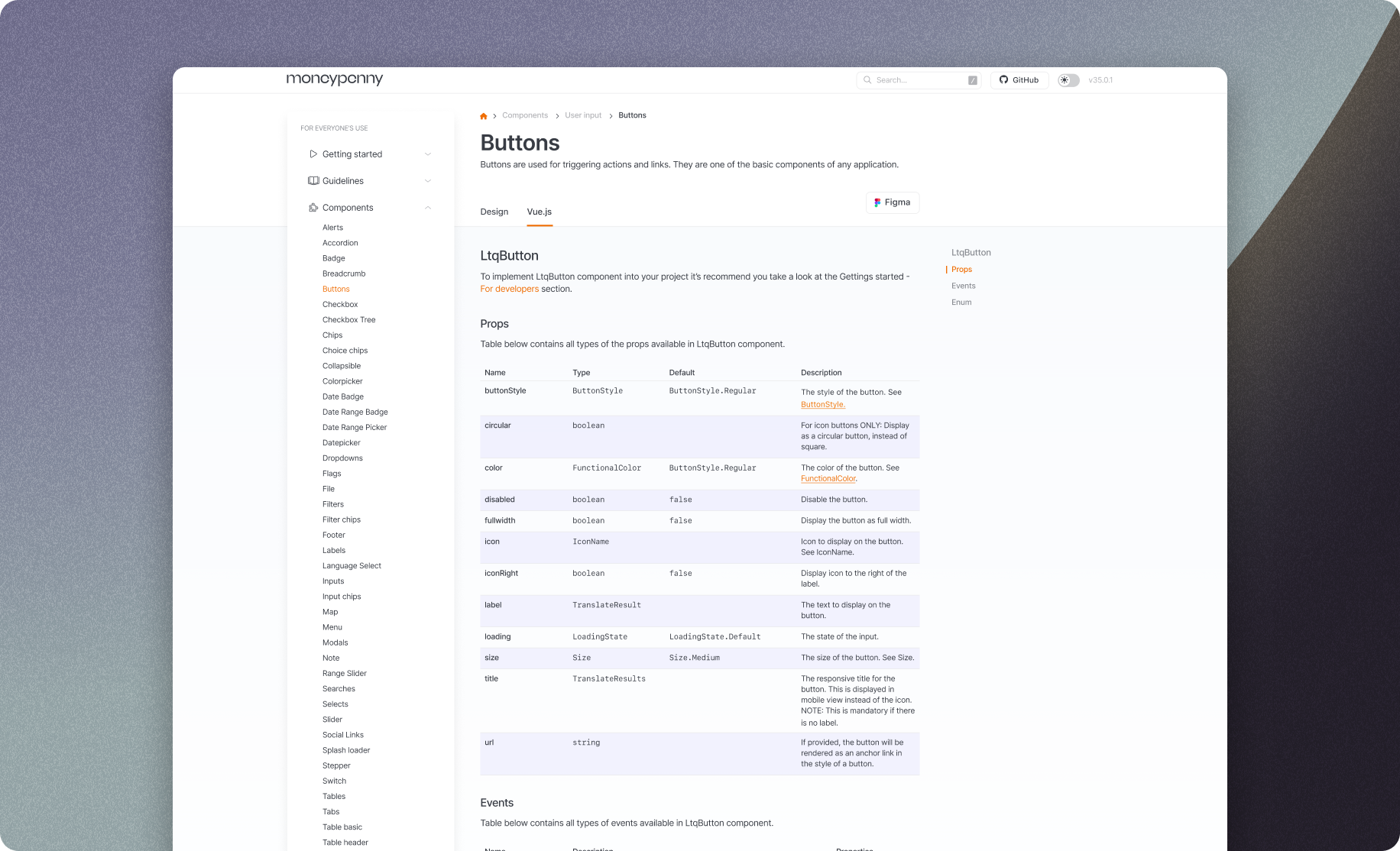
Custom Vue.js documentation site: live prop controls, full API reference, and a direct Figma link on every component page
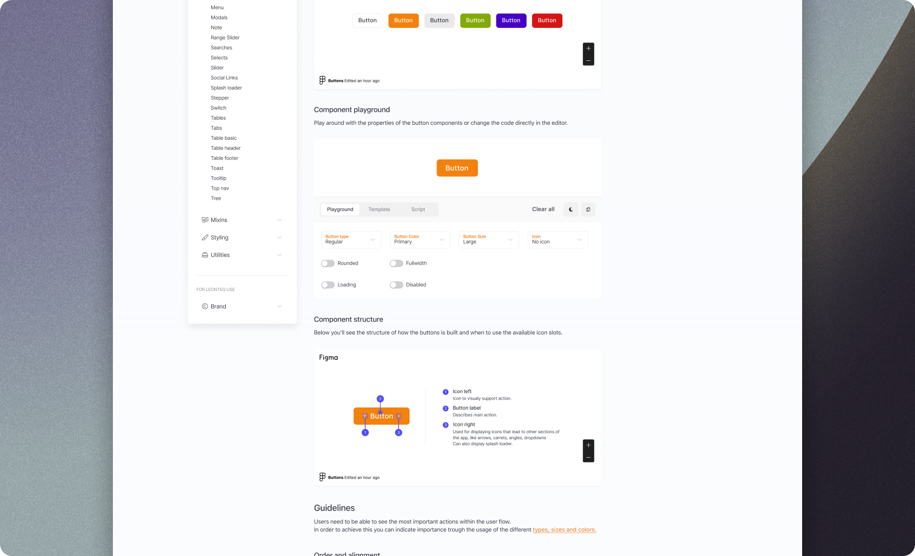
Interactive playground: live prop editing with instant visual feedback, reducing designer-developer back-and-forth.
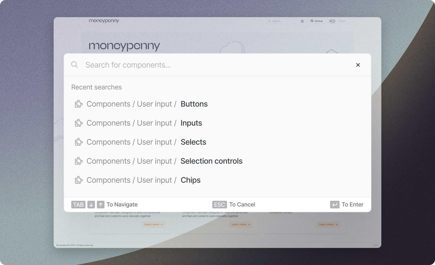
Full-text component search across variants, tokens, and usage guidelines — instant access to any part of the system.
0+
production components shipped in v1.0
0
product teams migrated in 18 months
0%
faster UI development velocity post-adoption
0%
design-to-code token parity between Figma and Vue
The Hardest Part
The components were straightforward. The governance wasn't.
Who decides when a pattern becomes a component? How do you prevent the system from becoming a bureaucratic bottleneck that slows teams down instead of speeding them up? How do you keep 8 teams contributing without losing coherence?
Our answer was a lightweight RFC process (easy to propose, deliberate to merge), combined with dedicated maintenance time and a culture of cross-team ownership. The system had to feel like infrastructure that serves the teams, not a style police that governs them. That distinction, more than any technical decision, is what made adoption stick.